Choosing Cyanotype Paper
Feb 24, 2020 / Photography / cyanotype process
While you could get precoated cyanotype paper, it’s not difficult to prepare your own. The benefit of making it yourself is the freedom to choose your paper type and paper size.
Four Considerations When Choosing Cyanotype Paper
The four things to consider when choosing paper for cyanotype: weight, archival quality, roughness, and size.
Paper Weight
The cyanotype paper gets wet twice. First, during the prep stage when you apply cyanotype emulsion on the paper. Second, during the washing stage when you wash the exposed cyanotype paper with several changes of water for 10 minutes. Light or thin papers disintegrate during the washing stage, so regular bond paper, for example, doesn’t work.
The lowest weight I’ve used for cyanotype is 90 gsm (grams per square meter, which is a universal standard for paper weight). You can undoubtedly use tissue-thin papers like Japanese washi and parchment. Those papers are inconsistent with my artwork, so I haven’t experimented with them. The important thing relating to paper weight is that the paper doesn’t disintegrate in the washing stage.
Archival Quality
You want your cyanotype prints to last, so the second consideration is to ensure the paper is archival, which means that it must be acid-free, no unbleached pulp, and no optical brighteners that make it look whiter. Archival paper is usually labeled “archival,” so they’re easy to identify.
Cold Press vs. Hot Press Paper
You also need to decide whether you want cold-pressed paper or hot-pressed paper. The main difference is the extent of paper roughness (by sight and touch). Cold press, in my opinion, is very rough. For my cyanotype work, I think it’s too rough, to the point of distraction. Because of this, I always use hot press.
Paper Size
I get my papers in large sheets (22x30in) from a Plaza Art store near me. If you go with pretreated cyanotype paper, you’re stuck around 8.5x11 inches. If you make your own, then you’re free to stay small, go larger with sheets, or go even larger with paper rolls. I like large sheets because my prints are all different shapes and sizes. I cut the cyanotype to whatever size after developing it.
Those are the top four considerations for choosing paper.
When I started cyanotype, I experimented with many papers. I’ll talk about my three favorites.
Arches Watercolor Paper Natural White 140lb Hot Press
I like this 310 gsm paper (~140lb equivalent) as it doesn’t buckle and wrinkle as much after drying. You can choose a thinner 90 gsm version of this paper, which I’ve also used and is still great, but it will not “stand up.” With my cyanotype prints, I want them to have gravity. Your work might call for a lighter paper. You decide.
Paper has smooth and rough sides (even with hot press paper). If you hold the paper against the light, you will see that one side is smooth and the other side is rough. Nobody told me this, but I get the sense that you’re meant to print on the smooth side. However, after experimentation, I prefer to print on the “wrong” side - the rougher side. My preferred artist mindset is to do the wrong thing. I don’t like the smooth side because the weave of the paper fibers becomes too prominent and distracting after the cyanotype is washed.
I like printing on the rougher side because it feels subversive (“you’re printing on the wrong side!”), but it’s also because the printed image has “grain,” which gives it a look of antiquity. This grain goes beyond “film grain.” It’s like the cyanotype image was unearthed in some archaeological excavation. That’s why I love cyanotype. Here’s a comparison of the digital image of Shouldering Sky vs. the cyanotype print version as an example of what I mean:
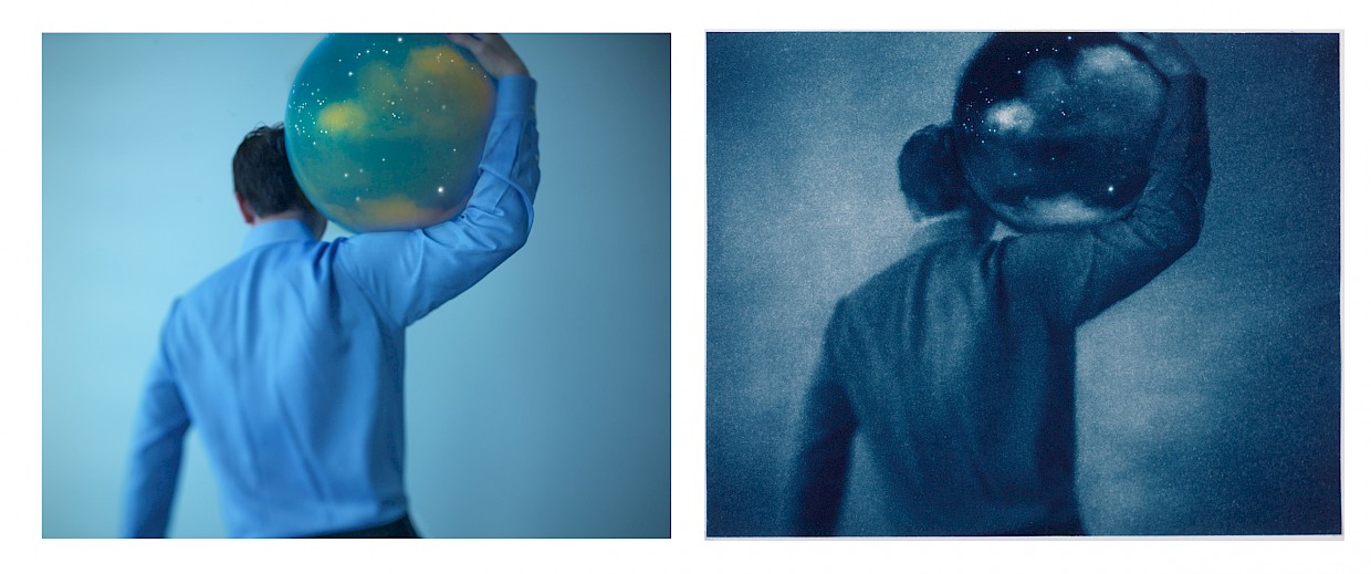
Look at the smoothness vs. roughness of the image.I did some dodging & burning (D&D) on the cyanotype version of the image. D&D is an old-time darkroom technique where you lighten and darken parts of the picture by the way you develop the print. You can do this in Photoshop too, which is the way I do mine. I prefer the roughness of the paper. That’s why I only use digital images for documentation, never as a final cyanotype image for sale on this site.
Arches Platine Paper Bright White 310 gsm
Another paper I like is the Arches Platine “bright white.” The prior section talked about “natural white.” These designations refer to the “color temperature” of the paper. Natural white has a tinge of yellow in it, while bright white has blue. Natural white is, therefore, “warmer” and the bright white “cooler.” Other than this, I don’t see any difference between these two types of paper. I tend to use natural white more than the cool white. The warmer version fits my old-fashioned work in Out of the Blue and One Day. Natural white shifts the coolness of the cyanotype a little bit to the warm side.
Epson Presentation Matte Paper
I’ve experimented with many papers, and this paper I’ve never forgotten. I don’t currently use it, but I can see myself using it in the future. Here’s a snapshot from my journal:
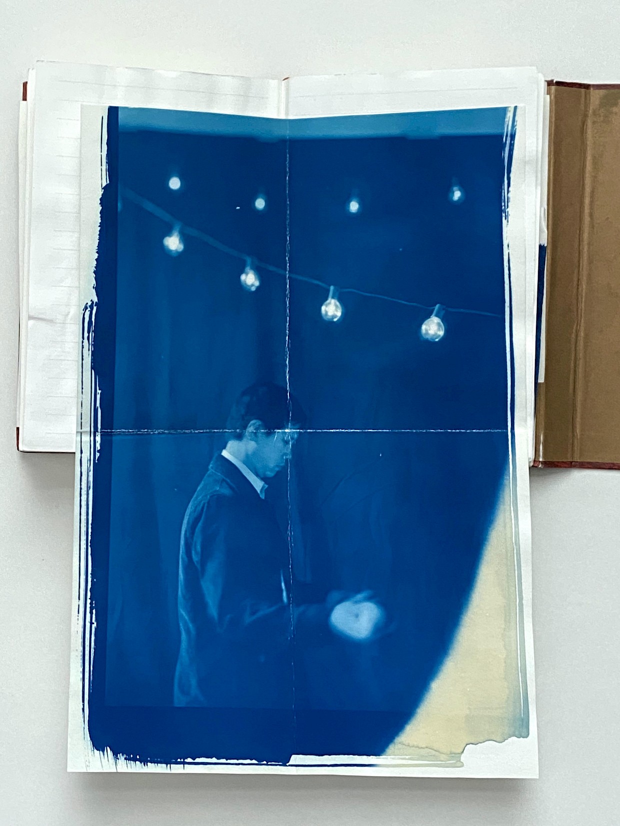
I’m going to contradict myself here. I like this paper because it’s very smooth. It’s almost like a digital print because it’s too perfect: it has no grain, and it renders too much detail (is that even possible?). It also has this muted blue color. I’m using the printing side of this paper (not the back or “wrong” side). There is always a concern about using papers like this for alternative process printing since they’re meant for printer inks. However, this test print is nine years old, and it hasn’t degraded or faded. I still like it for its modern feel. I can see myself using this wrong paper for future cyanotype work.
Runner Ups - Other Papers To Try
Recently, I rediscovered these papers in my archive of old cyanotype prints, and I think they’re exceptional too:
- Rives BFK Somerset Satine 300gsm. I love how pliable this paper is—almost like cloth. A cyanotype image printed on this paper looks ancient. It reminds me of aged leather.
- Vellum Paper is surprisingly very strong and thin. I recently discovered this one (affiliate link) that I will be experimenting with.
So there you have it, my three choices for cyanotype paper plus some runner ups that I’m excited about. However, there are really so many papers that will work as long as they follow the guidelines I set out above.
If you’re working in cyanotype or another alternative process, what papers do you like?
Download “Think Like an Artist” PDF
Receive the “Think Like An Artist” reading list PDF that support my artist journey. While you may not be an artist (not everybody wants to be), I believe the artist mindset improves day-job performance. Apply the artist mindset at any age—at work and at play.