That David Hockney Painting (Or How I Ended Up Doing Collage)
Jul 21, 2014 / Photography / synchronicity / Influences / David Hockney
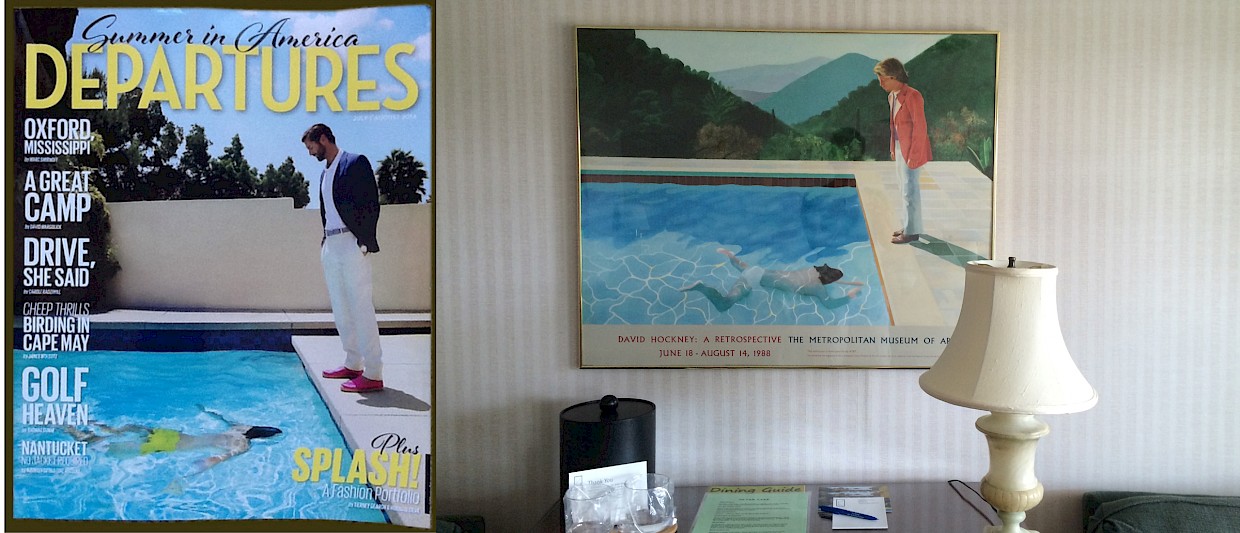
I kept seeing David Hockney the past two weeks: first, in the Departures magazine cover for July/August; second, as I was hunting for a book to bring to the beach; and third, in a poster at a bed & breakfast place in Rehoboth Beach, Delaware! In honor of these coincidences, I decided to write an origin story this week, as in, how I ended up doing collage. David Hockney had a lot to do with it.
Coming from a non-arts background, my art history knowledge was virtually zero when I started my MFA in 2010, so understandably, I’ve never heard of Hockney. He’s a painter, and I wanted to be a photographer. Totally different mediums I said to myself, and so I didn’t pay attention even when I saw his photographic experiments from the 1980s. He called these photo collages “joiners.” They were interesting, but I didn’t like how visually noisy they were, and so I soon forgot about them.

In May 2012, I came across the book, David Hockney: The Biography, 1937-1975, at the San Francisco Museum of Modern Art bookstore. The book had just come out then, and it was prominently displayed. As I leafed through it, I became captivated by this painting.
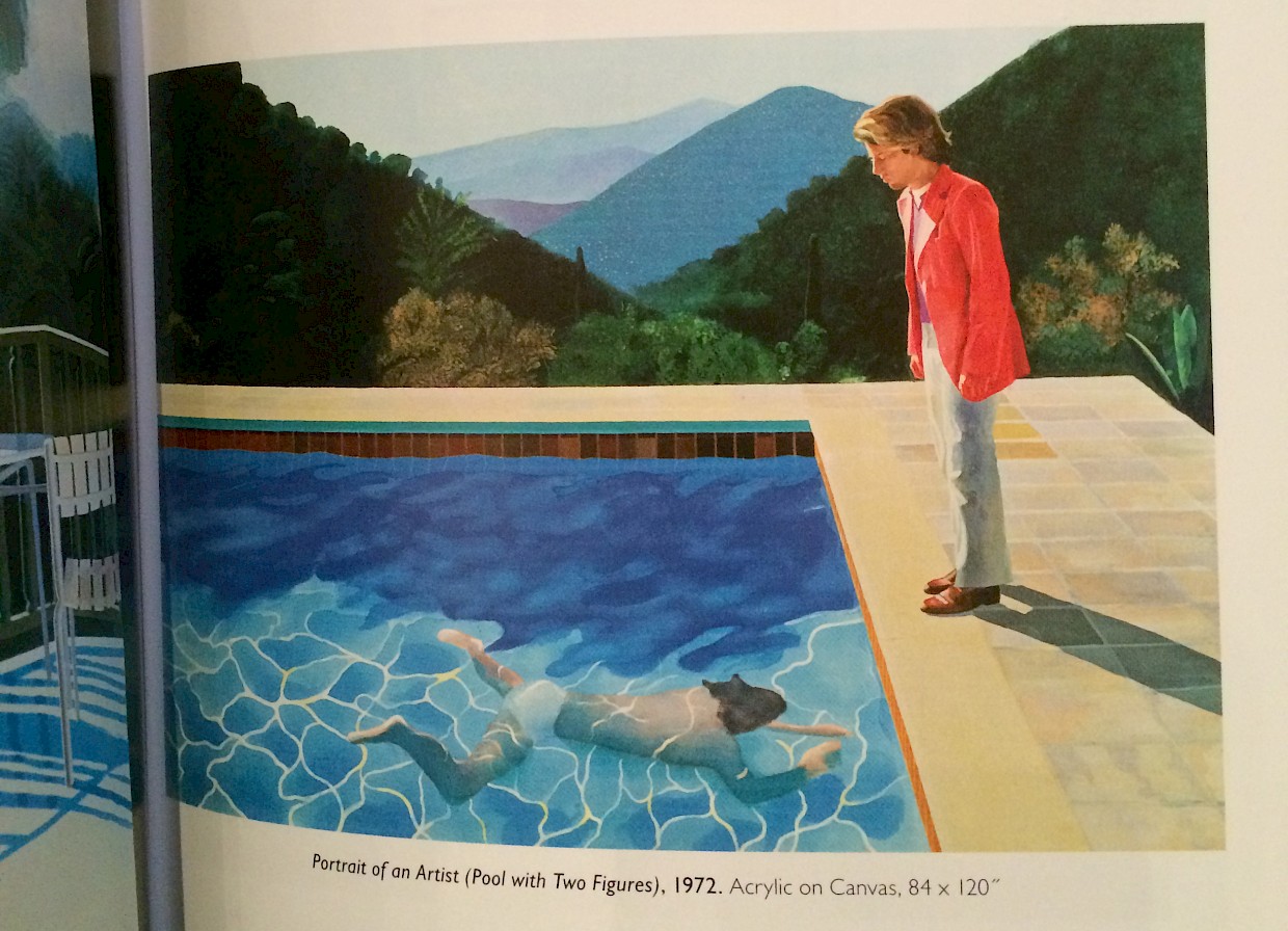
It was a beautiful painting, so light and airy. I was intrigued by the relationship between David Hockney and Peter Schlesinger, the subject of this painting. While the book recounts Hockney’s rise as a painter, it also tells a love story between the two and their subsequent breakup in the 1970s. When Hockney painted this, they had already broken up. It seemed to me that this painting was Hockney’s way to rekindle what they had or it was a way to acknowledge that Schlesinger was also an artist in his own right (hence the title, Portrait of an Artist). The mixture of fact and fiction and of love and loss was irresistible. I was pulled right in, and I bought the book.
That was the start of my David Hockney immersion period. I read many books about him and his work in the summer of 2012.
In one of those books, he posed a question that intrigued me: “Why is a painting based on the camera (and with one viewpoint) more interesting than a photograph taken from the same spot and enlarged–even when taken with a large plate camera?” His conclusion was that the static quality of photographs, its lack of staying power, is due to the removal of the artist’s hand. The camera creates the picture instantaneously. It is the same time on the top left of the picture and at the bottom right of the picture. A painter’s hand moves across the painting for months, and we sense this accumulation of marks as “time.” We therefore look at a painting longer than a photograph. (p10, On Photography)
His observations pissed me off, but at the same time they intrigued me. He believed that his joiner technique broke this “lack of time” in a photograph. A viewer spends a lot of time looking at joiners, piecing the whole scene together.
I started experimenting with joiners. I was thinking that maybe I could use the approach to suggest layers of the future that could be rearranged and changed (an idea that I’m obsessed about in my work). I still didn’t like how visually noisy they were, but I proceeded anyway. My first experiments in joiner collages and one that was an absolute total failure (what was I thinking on that one?):
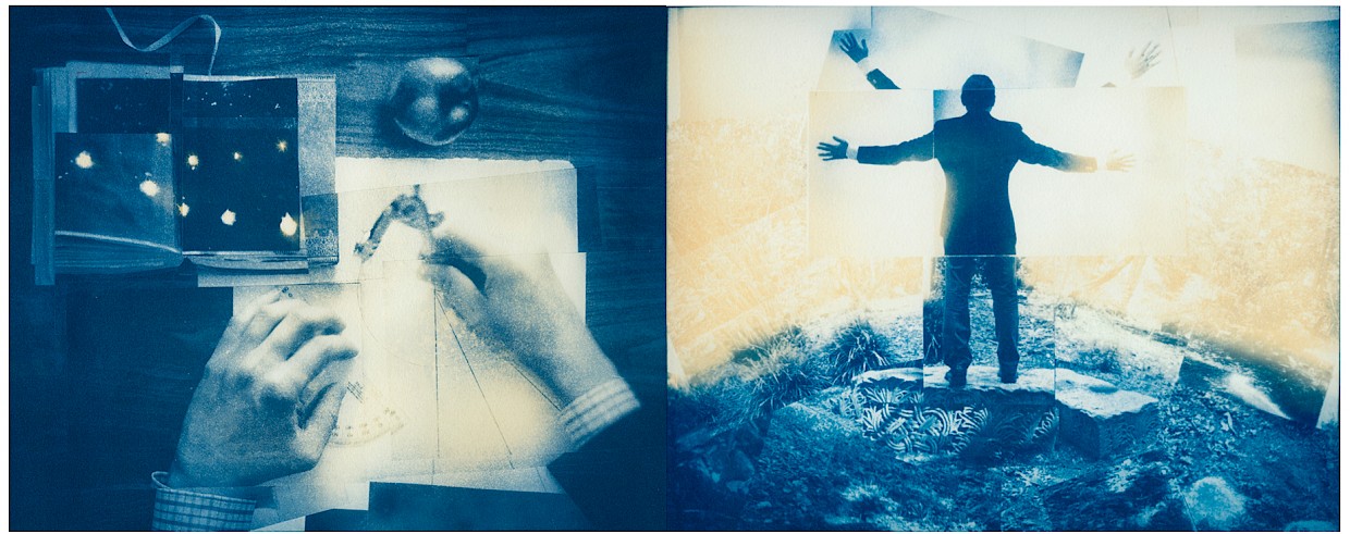
Over time though, I found that too much image fragmentation did not make sense for my work. The conceptual basis of Hockney’s joiners is cubism, which I started to view as a way to illustrate how we actually see reality–by taking in bits and pieces of a scene from many vantage points and having our minds assemble them into a cohesive whole. Cubism is tied too much to the present when what I was seeking was the future. I reasoned further that a Hockney joiner might be composed of hundreds of photographs where each component photograph cannot stand by itself (and therefore meaningless). I didn’t want that, and so I continued to experiment. I felt that there was something about collage that I could use. I just had to figure it out.
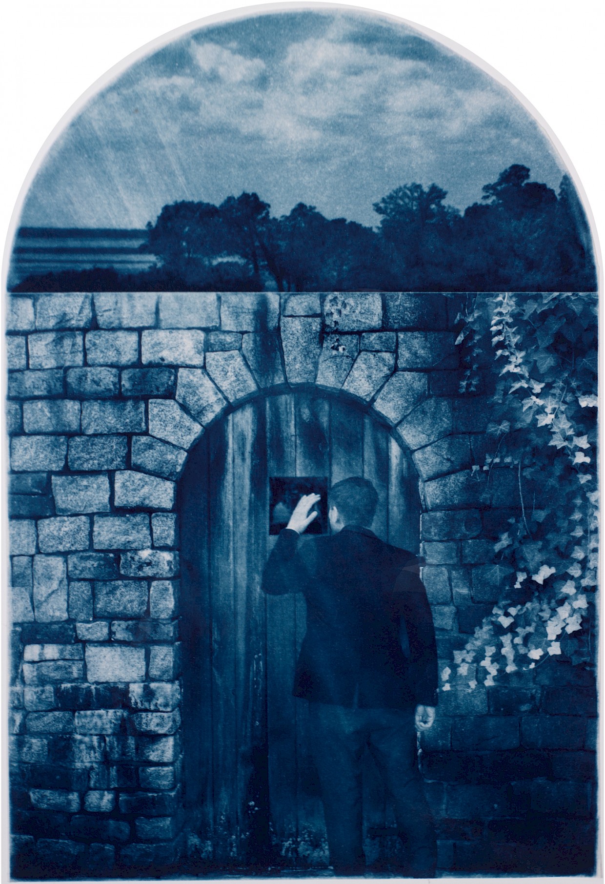
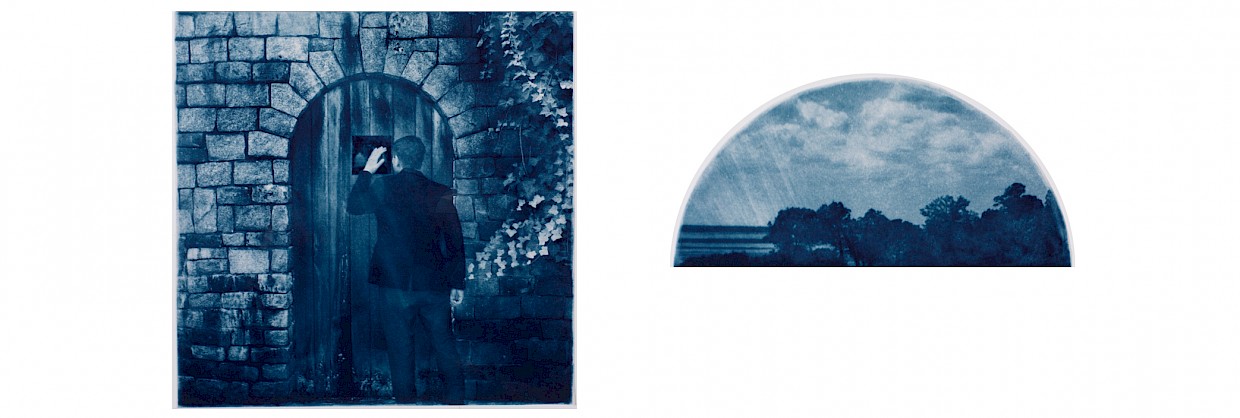
The answer eventually came to me: each component image had to be larger; it had to encompass an entire time and place. By doing so, I could then take one image representing a distinct time and place (the present for example) and join it with another time and place (the future). My message would then be clearer, and the image would still retain that quiet stillness of the cyanotype print that I love so much. That’s how I ended up doing collage, and it all started with David Hockney’s painting that wasn’t even a collage. Funny how that works.
The final image:
