What Picasso Can Teach Us About Spreadsheets
Mar 6, 2017 / Day Job & the Practical / spreadsheets
We’ve looked at the most important consideration in spreadsheets and that is the data-ink ratio, a word coined by statistician Edward Tufte in the 1980s in his book Beautiful Evidence.
We’ve looked at the importance of value, proximity, enclosure, continuation, emphasis, color, and similarity.
We’ve also talked about denotation and connotation and how that’s important not only in art, but in spreadsheets as well.
But Jonah, What has Picasso got to do with spreadsheets?
Picasso and Spreadsheets
Picasso is undeniably the greatest and most influential artist of the 20th century. He co-created cubism and was the first artist to incorporate collage into painting. I use collage in my artwork, so it’s thanks to Picasso for creating this technique for all the millions of artists who came after him.
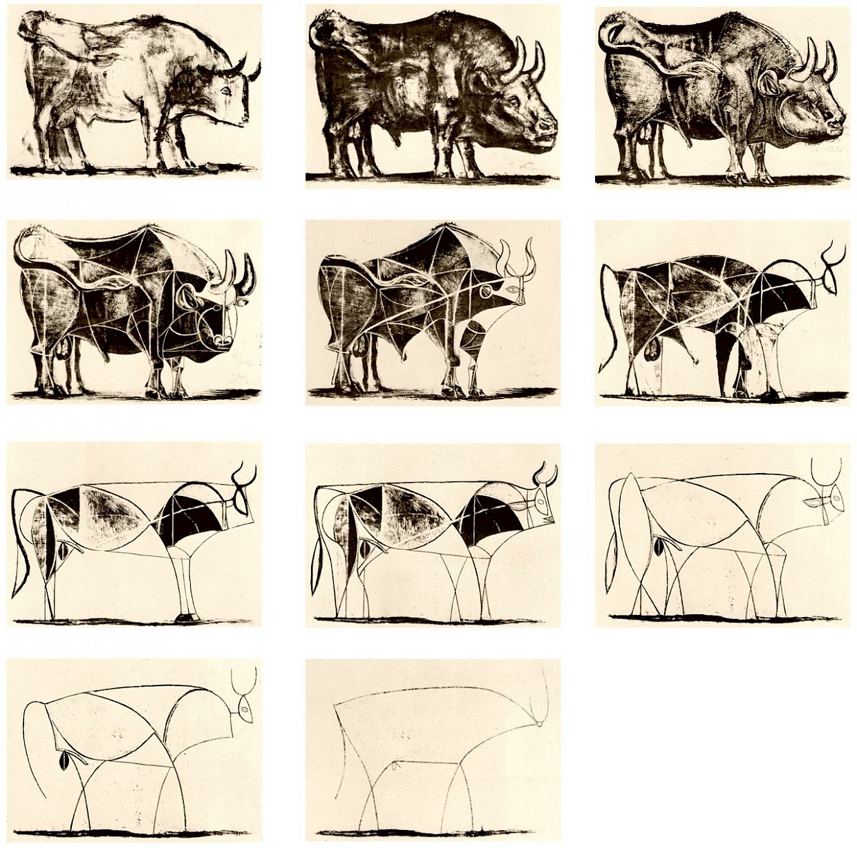
We can learn a lot about how to improve spreadsheets by looking at Picasso’s artistic process. Take his bull lithographs from the 1940s.

You can see how he starts with a very detailed rendering of a bull, and through subsequent revision and simplification, he arrives at the essence of a bull.
In our spreadsheets, we have to strive for the same thing: we have to simplify to get to the essence of the spreadsheet.
Most people create spreadsheets that are so busy. It has gridlines, it has too much color, it has icons, arrows going every which way, and copious footnotes. Who can understand such a thing? Nobody can. Most people’s spreadsheets are like a very busy drawing of a bull.
So what does Picasso do? He removes all the non-data ink. He strips and strips the form of the bull until he gets to the core.
Do the same thing with your spreadsheet. Reduce it until you get to the core.
And here’s how you do it.
3-step Framework for Improving Spreadsheets
How do you ensure that the spreadsheet is the best that it can be in communicating your message?
Here’s what I do, and it involves three steps.
1. Remove all the ink that does not represent data (“non-data ink”).
2. With the remaining data on the spreadsheet, use art principles to enhance the denotations, connotations, and associations that you want to make.
3. Do the thumbnail test and a test print of your spreadsheet.
In step 1, maximize the data-ink ratio. This is the most important step. Remove anything that is not data in your spreadsheet. Ask yourself: “If I remove this, will it change the meaning of the spreadsheet?” If no, then remove it.
In step 2, use the art principles that we’ve talked about to improve and sharpen the associations between items in the spreadsheet using value, proximity, enclosure, continuation, emphasis, color, similarity. Make sure items are grouped together that should be seen and “linked” together. Re-read the blog posts for each of these art principles. I put the links at the beginning of this post.
In step 3, do the thumbnail test to assess the visual flow and balance of your spreadsheet. Better yet, do a test print. Print your spreadsheet (make sure you define the print area in Microsoft Excel) and look at the printed piece at arm’s length. Is it balanced? We talked about this in this blog post.
Repeat these steps until you get to the core message of your spreadsheet.
Now it’s your turn
Let me know how it goes. If you have any questions, please email me and let me know how you’ve used these art principles on your spreadsheets.


